Tutorials
How to Build a High-Converting SaaS Landing Page Faster
Learn what makes a strong SaaS landing page and discover Probe, a free Framer template built for B2B, AI, and technology-driven startups.
Launching a SaaS product, AI tool, or B2B platform is already hard enough. You need to define your offer, explain your value, build trust, capture leads, and make your product feel credible before people even try it.
Your landing page has to do a lot of work.
But here’s the problem: many SaaS landing pages either feel too generic, too empty, or too complicated. They try to say everything at once, but fail to create a clear path for the visitor. Instead of helping people understand the product, they create friction.
A strong SaaS landing page does the opposite. It gives structure to your message. It creates confidence. It helps users understand what you do, who it is for, why it matters, and what they should do next.
That’s exactly why starting from a well-designed SaaS landing page template can save so much time.
In this article, we’ll break down what makes a high-converting B2B SaaS landing page, what sections you should include, and how a Framer template like Probe can help you launch faster with a polished, professional website.
Why your SaaS landing page matters so much
For many SaaS and technology companies, the landing page is the first real point of contact with potential users, customers, partners, or investors.
Before someone books a demo, creates an account, joins a waitlist, or contacts your team, they need to feel that your product is worth their attention.
That first impression happens quickly.
Visitors will ask themselves questions like:
Does this product look trustworthy?
Do I understand what it does?
Is this relevant to my problem?
Does this company look serious?
Can I imagine using this solution?
If the page feels unclear, outdated, or unstructured, people leave. Not always because the product is bad, but because the website did not create enough confidence.
A good SaaS landing page is not just decoration. It is a strategic asset.
It helps position your product, frame your offer, and guide visitors toward action.
What makes a good SaaS landing page?
A high-converting SaaS landing page does not need to be overloaded. In fact, simplicity is often more powerful than complexity.
The best SaaS websites usually share a few key qualities.
They have a clear hero section that explains the value proposition in seconds. They show who the product is for. They present the main benefits before going into features. They include visual proof, use cases, or product previews. They answer doubts before they become objections. And they repeat the call-to-action at the right moments.
The goal is not to impress visitors with endless effects or vague marketing language. The goal is to help them understand your product and feel ready to take the next step.
That is especially important for B2B, SaaS, AI, and technology-driven brands, where the offer can sometimes be abstract or complex.
Your design should make the product feel simpler, not more confusing.
The essential sections of a B2B SaaS landing page
A strong B2B landing page usually follows a clear structure. You do not need to reinvent everything from scratch. You need the right building blocks, arranged in the right order.
The first section is the hero. This is where you communicate the core promise of the product. Your headline should be specific, direct, and benefit-driven. Avoid vague statements like “The future of productivity.” Say what the product actually helps people do.
Then comes the problem or context section. This helps visitors recognize themselves. You can show the friction they currently face and position your product as the natural solution.
After that, introduce the main benefits. Benefits are not just features. A feature is what the product includes. A benefit is what the user gains from it. For example, “automated reporting” is a feature. “Save hours every week on manual reporting” is a benefit.
Next, you can present use cases. This is especially useful for SaaS and AI tools because different types of users may use the same product in different ways. Use cases help each visitor understand how the product fits their specific situation.
Then come features, testimonials, integrations, pricing, FAQ, and final CTA. Not every landing page needs all of these, but most SaaS websites need at least some of them to build trust and reduce hesitation.
This is where using a modular Framer template becomes useful. You can start with a complete structure, then remove, reorder, or adapt sections based on your product.
Why Framer is a strong choice for SaaS landing pages
Framer has become a popular choice for startups, creators, designers, and modern digital brands because it makes it possible to create polished websites without relying on a heavy development process.
For a SaaS landing page, this matters a lot.
You often need to move fast. Maybe you are validating an idea. Maybe you are launching a waitlist. Maybe you are preparing for Product Hunt. Maybe you need a professional homepage before a funding announcement or client presentation.
In those situations, spending weeks on a custom website can slow you down.
With Framer, you can design, customize, publish, and iterate quickly. You can adjust copy, sections, visuals, and layout as your positioning evolves. That flexibility is important because early-stage SaaS messaging rarely stays fixed forever.
A good Framer SaaS template gives you a professional base, while still giving you the freedom to make it your own.
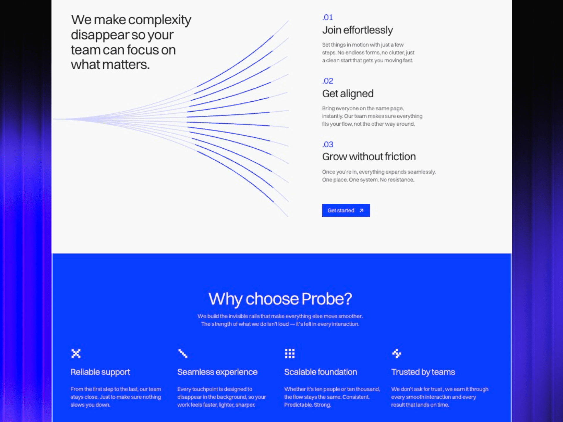
Introducing Probe: a free Framer template for SaaS, B2B, AI, and tech brands
Probe is a free Framer landing page template designed for SaaS products, AI startups, B2B platforms, and technology-driven companies that want to launch with clarity and confidence.
It was built around a simple idea: your landing page should help your product feel established from day one.
Instead of starting from a blank canvas, Probe gives you a structured foundation with sections that already fit the needs of modern software and technology brands.
The design is clean, geometric, professional, and precise. It avoids the overly playful or generic look that many templates fall into, while still feeling modern and animated.
That makes it especially relevant for brands that want to communicate trust, innovation, and technical credibility without looking cold or boring.
A structured design system that saves time
One of the biggest advantages of Probe is its modular structure.
When building a SaaS landing page, you rarely know the perfect structure from the beginning. You may need to test different headlines, move sections around, add a use case, remove a feature block, or adapt the page for a new audience.
Probe is designed to make that easier.
Its sections can be mixed, rearranged, and customized, which helps you build a page that fits your product instead of forcing your product into a rigid layout.
This is useful whether you are creating a homepage for a SaaS product, a landing page for an AI tool, a B2B service page, or a launch page for a new platform.
You start with a professional structure, then adapt it to your message.
Designed for trust and conversion
A SaaS landing page needs to look good, but it also needs to guide attention.
Probe uses a minimal, structured visual language built around sharp layouts, modern typography, subtle motion, and geometric details. The goal is not to distract from the message, but to make the page feel more confident and memorable.
The animated hero section helps create a strong first impression, while the rest of the page keeps the experience clear and readable.
That balance matters.
Too many animations can make a website feel noisy. Too little visual personality can make it forgettable. Probe sits between those two extremes: polished enough to stand out, simple enough to stay focused on conversion.
Who is Probe best for?
Probe is especially well suited for SaaS founders, AI startups, B2B platforms, software companies, tech consultants, productized services, and early-stage teams that need to launch a professional landing page quickly.
It can work well for:
AI tools
Analytics platforms
Automation software
Cybersecurity startups
Developer tools
B2B SaaS products
Productized tech services
No-code tools
Internal software platforms
Startup MVPs and waitlists
Because the design is flexible and not tied to one specific niche, it can be adapted to many types of technology-driven products.
The key is to keep the message clear and use the template structure to support your positioning.
How to customize Probe for your own SaaS product
To get the best result from a SaaS landing page template, do not simply replace the logo and colors. Start with your message.
First, define your core promise. What does your product help people achieve? Make that the foundation of your hero headline.
Then, rewrite each section around your customer’s problem. Avoid talking only about your product. Talk about what your user wants, what slows them down, and how your solution helps.
Next, adapt the use cases. This is one of the best ways to make your landing page more persuasive. Instead of presenting your product in a generic way, show how it helps specific types of users or teams.
After that, customize the visual identity. Adjust colors, typography, images, and icons so the template feels connected to your brand.
Finally, simplify. A good landing page is not the one with the most sections. It is the one where every section has a purpose.
Why starting with a template can be better than starting from scratch
There is a common belief that a serious SaaS product needs a completely custom website from day one.
In reality, that is not always true.
At an early stage, what matters most is speed and iteration. You need to launch, learn, and improve. A strong template helps you avoid wasting time on basic structure and layout decisions, while still giving you a professional result.
Starting with a Framer template does not mean your website has to look generic. It means you begin with a strong foundation and focus your energy where it matters most: positioning, messaging, offer, and conversion.
For many SaaS teams, that is a much better use of time.
Final thoughts
A high-converting SaaS landing page is not just about beautiful visuals. It is about clarity, trust, and momentum.
Your website should help visitors understand your product quickly, feel confident in your brand, and know exactly what to do next.
If you are building a B2B product, SaaS platform, AI tool, or technology-driven business, starting with the right template can help you move faster without sacrificing quality.
Probe was designed for that exact purpose: to help modern tech brands launch a confident, structured landing page in less time.


